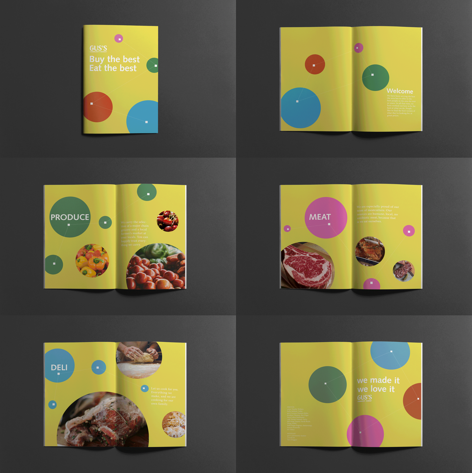
We Made It, We Love It.
“We are an extension of your kitchen, your pantry, your home. ”
—Guss Vardakastanis
We redesigned the sign visible.


Background
This project extends the discussion of semiotics into a more tangible. We are looking for an ugly sign on the street. We redesigned the sign visible. Using the sign to convey information for people is our goal. And then we developed a system for the company which we found the sign. We designed a poster series, a narrative component and a digital component.
Approach
The main idea of the design and logo is a circle. Using circular shapes and lines presents the relationship between the owners and customers. The logo is used Mercurius, which expresses a casual and friendly feeling. The font of ”Community Market” is Univers, that is legible. Customers can rest assured to purchase products in our store.
